
Color theory is a fundamental concept in the visual arts, and it plays a significant role in evoking emotions and creating impactful artworks. The use of color is a powerful tool for artists to convey ideas, stimulate feelings, and create aesthetic experiences for viewers. By understanding the emotional implications of different colors and their combinations, artists can effectively communicate their intended messages and elicit desired responses from their audience.
When it comes to color and emotion, one of the most well-known associations is the color wheel. The color wheel is a visual representation of colors arranged in a circular format, showing their relationships and harmonies. It serves as a fundamental tool for artists, designers, and anyone working with color, providing a basic framework for color theory and its practical applications.
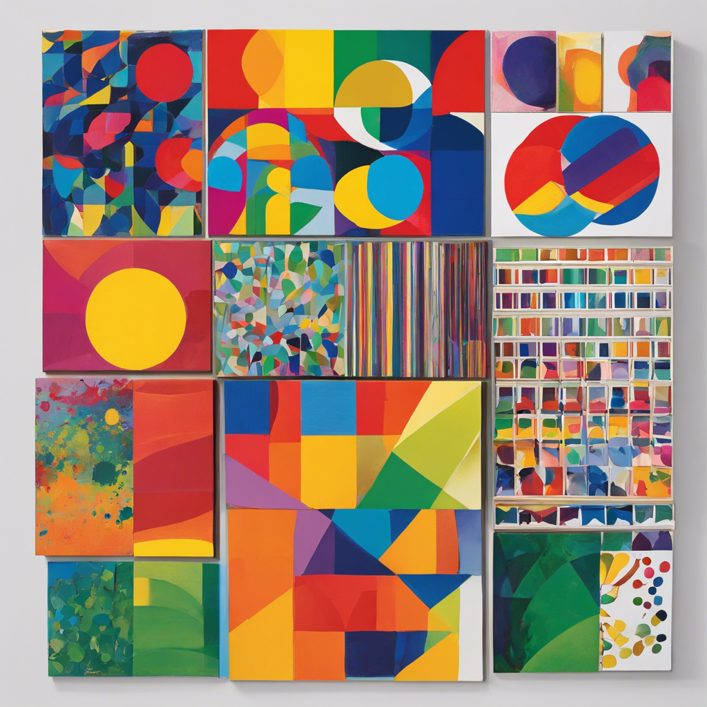
Warm colors, such as red, orange, and yellow, are often associated with energy, passion, and excitement. They can evoke feelings of warmth, enthusiasm, and even aggression, depending on the context and their intensity. For example, red is often used to represent love, desire, and power, while yellow can symbolize happiness, optimism, and creativity. On the other hand, cool colors like blue, green, and purple are commonly linked to calmness, serenity, and tranquility. These colors can evoke feelings of peace, relaxation, and stability. Blue, in particular, is often associated with trust, confidence, and reliability, while green represents balance, harmony, and nature.
Color context and culture are also important factors that influence the emotional response to color. The same color can evoke different emotions depending on the surrounding colors, the amount used, and the cultural background of the viewer. For instance, in Western cultures, white is often associated with purity, innocence, and cleanliness, while in some Eastern cultures, it may symbolize mourning and death. Similarly, the meaning of colors can also vary depending on personal experiences and associations.
Contrasting colors create a vibrant and energetic vibe, while analogous color schemes, featuring colors next to each other on the wheel, offer a more harmonious and peaceful mood. Artists also use complementary colors to make their subjects stand out, add drama, and create an intense emotional response.
The emotional impact of color is not just theoretical but has been supported by scientific research as well. Studies have shown that color can affect our mood, behavior, and even physical reactions. For example, certain colors can influence our heart rate, blood pressure, and respiration, demonstrating the powerful and multifaceted effects of color on our emotional and physical state.
Color theory also explores the psychological effects of color, such as the impact of color on perception, cognition, and behavior. Artists and designers often use color psychology to create spaces or designs that promote specific emotional responses, such as using calming colors in hospitals to promote relaxation and healing or stimulating colors in gyms to increase energy and motivation.
In conclusion, color theory and emotion are intimately linked in the visual arts. Artists have a vast emotional palette at their disposal, and their color choices can significantly influence how viewers perceive and respond to their artworks. By understanding the emotional implications of color, artists can effectively use this powerful tool to create compelling and evocative works that resonate with their audience on a deeper level. Whether stirring passion or soothing the soul, color plays a crucial role in the artistic realm.
Feel free to add any accompanying images or videos to enhance the visual appeal of the article when publishing!